The menu, the website, and the taproom screen — from one simple place.
How I moved an award-winning Langley brewery off a fragile template-builder site — and replaced it, plus a stack of hand-built menu PDFs, with one CMS the staff can edit without breaking anything. Then kept sharpening it until the menu felt less like a webpage and more like part of the taproom.
Brewery of the Year, with a menu held together by hand.
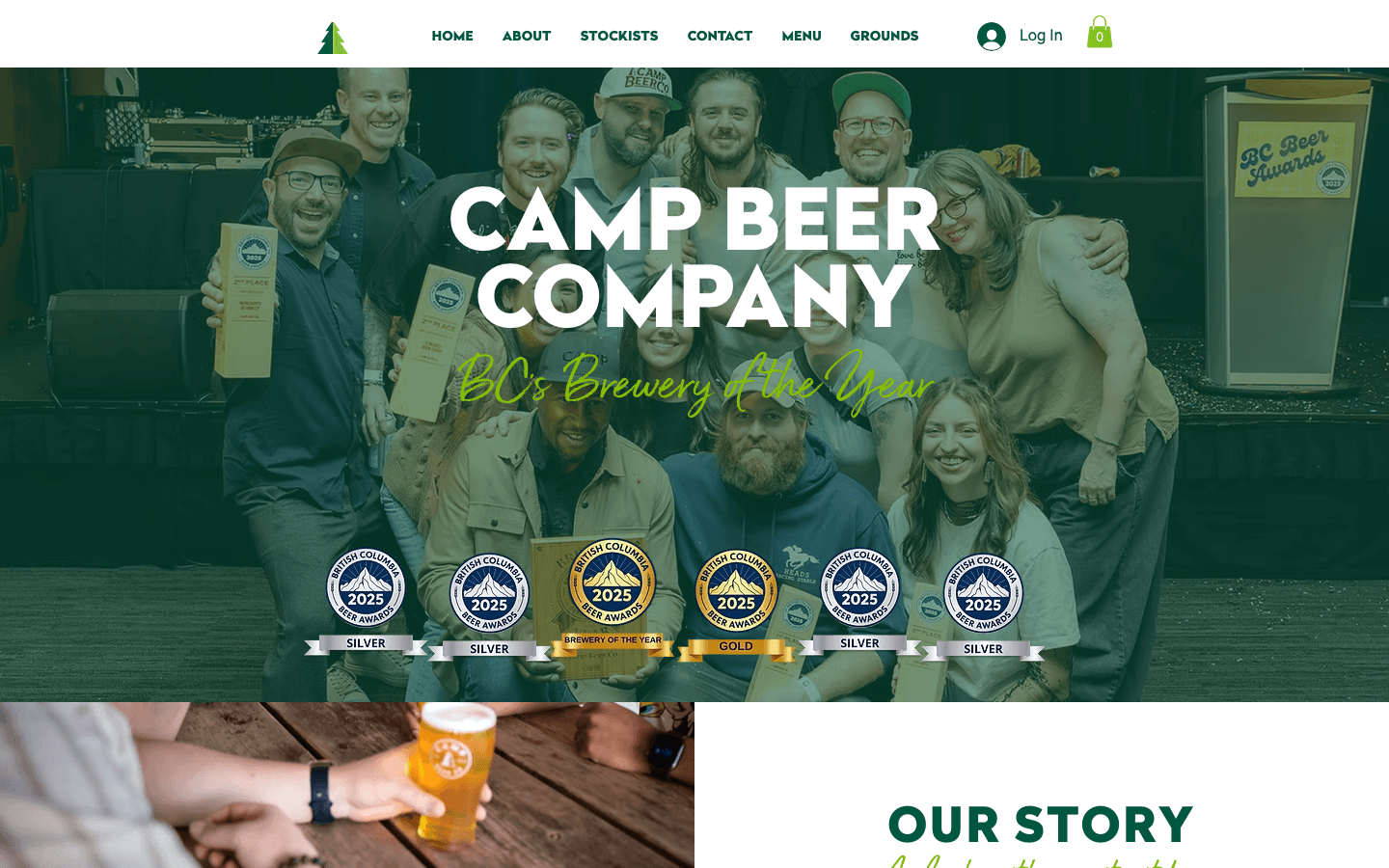
Camp Beer Co. is a Langley brewery and taproom with a wall of hardware to show for it — BC Beer Awards’ Brewery of the Year, a long shelf of medals, and a tap list that changes constantly. The beer and the room are excellent. The way the menu got onto a screen was anything but.
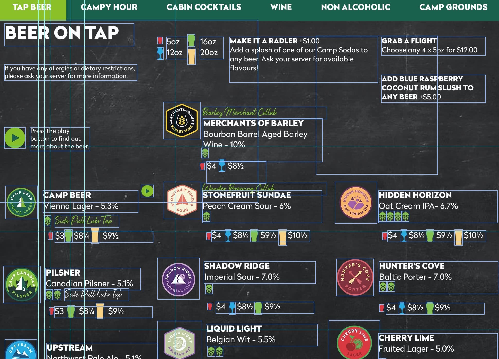
The website ran on a drag-and-drop template builder — the kind that looks easy in the demo and turns into a wrestling match the first time you need to change something real. Editing the menu meant dragging text boxes around a canvas, and a single price change could throw a column out of alignment or quietly break the layout. So the team stopped trusting it. The real menu got rebuilt by hand in InDesign and re-exported as PDFs every keg change; the taproom TV was a third, separate export mirrored off an iPad. Three menus, three sources, none of them live.
And the ask went past looks. Guest experience is priority one at Camp — it’s why people cross the valley for the taproom — and they wanted a site that treated it that way. Not a brochure: something interactive and alive, that could tell a guest whether it’s patio weather, whether the doors are open right now, what’s pouring, when Campy Hour hits.
So the brief was really two jobs: rebuild the website to match the brand and make it live like the room does. And underneath both, what the operation needed was a single source of truth the staff could edit without fear of breaking it.
Four problems, one root cause.
A template you had to fight
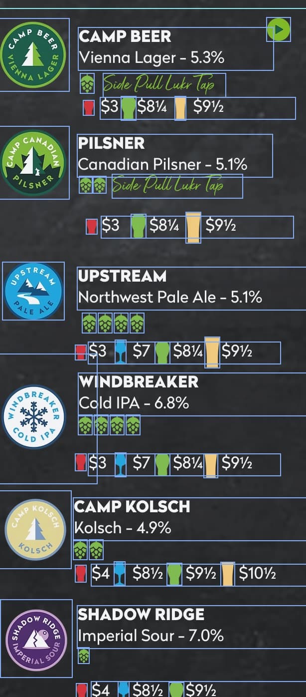
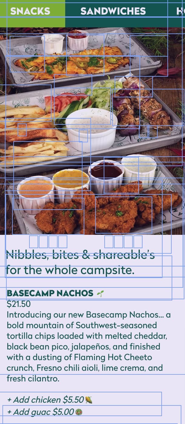
The old site was built on a drag-and-drop template builder. Updating the menu meant nudging text boxes on a canvas — and a single price change could knock a column out of alignment, push the layout, or break the page in ways only someone with an eye for design would even catch. Editing was fragile, fiddly, and easy to get wrong.
The menu was a recurring job
Because editing the live site was risky, the real menu lived elsewhere — rebuilt by hand in InDesign and re-exported as PDFs every time a keg blew. The brewery's drive held hundreds of dated versions. An award-winning brewery that changes taps constantly was spending real time just keeping the menu current.
Three menus, three sources
The printed taproom menu, the website, and the in-house TV tap list were all maintained separately. They drifted out of sync the moment anything changed, and nothing was actually live.
Seven years of beer, nowhere to see it
Two-hundred-plus beers brewed since 2018 — collabs, one-offs, seasonal favourites — lived only on Untappd. None of that history or personality made it onto the site.
Same brewery. One source of truth.
Built for a phone at a table — then built again.
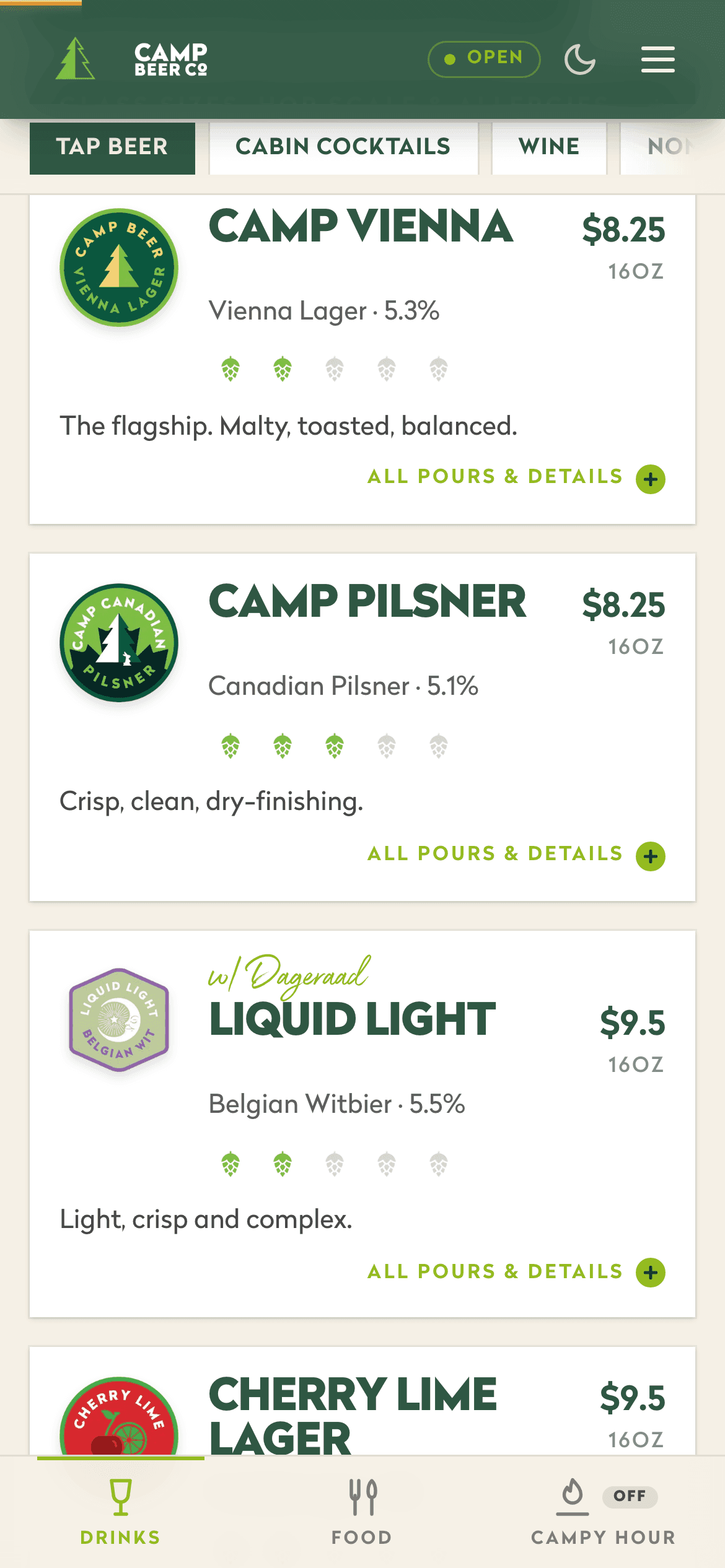
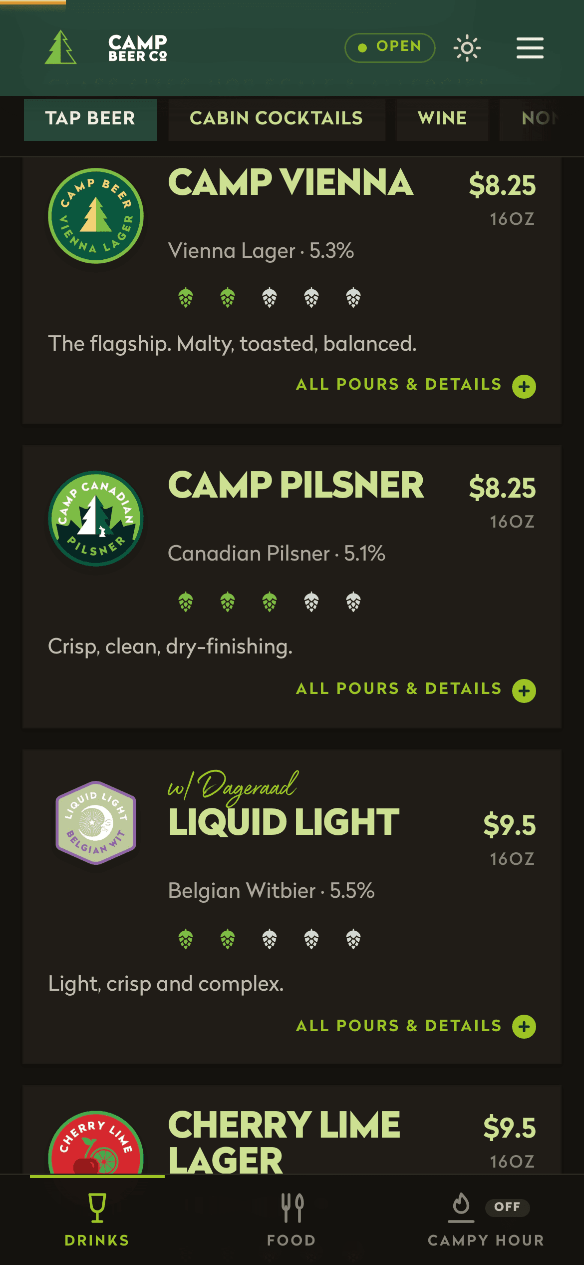
The QR menu is the most-scanned page on the site: a guest at a table, phone in one hand, fifteen taps to choose from. So it gets treated like the product it is — not a page that lists beers, but the thing you hold while you decide. Everything below runs on the same live taplist the TV and the website read.
The menu doesn’t stop at the table.
The ops layer nobody has to think about.
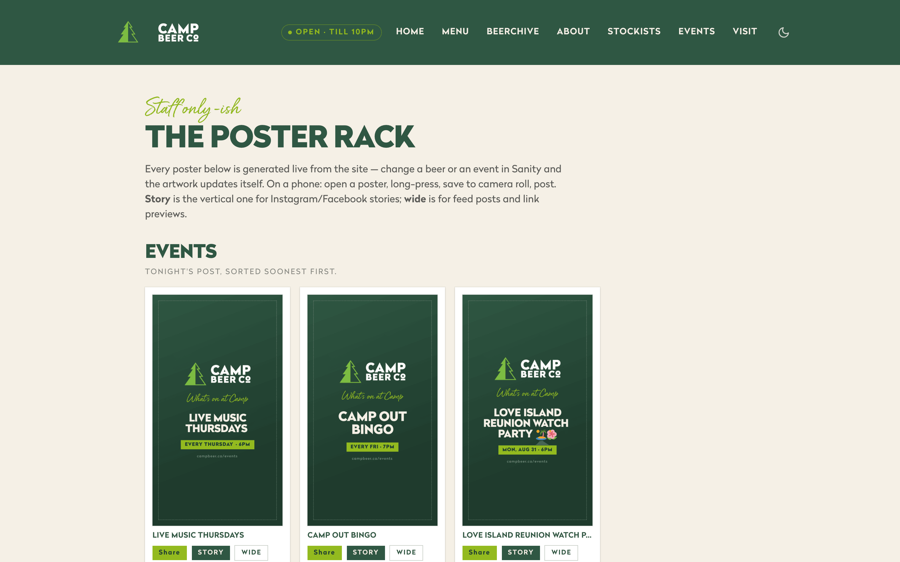
The one-source-of-truth idea only holds if the source stays healthy without anyone babysitting it. So the boring work automates itself. When staff publish a beer, a wrapped publish action stamps it “New on tap” automatically — nobody remembers to add the badge because nobody has to. Recurring events compute their own next occurrence, so the events strip on the QR landing page always names the next thing happening at Camp without anyone re-entering a date.
And inside Sanity, a Content Health dashboard names every gap in the content — beers missing badge art, blank descriptions, events without dates — so the GM opens one screen and knows exactly what needs attention, instead of clicking through the site hunting for holes.
The running costs went the same direction as the labour. Hosting, the CMS, and every poster render sit on Camp’s own accounts, and the monthly bill is lower than the Wix subscription it replaced. A site that does more, costing less to keep on — that’s what happens when the ongoing fees are for infrastructure instead of for permission to edit.
Make it feel like the room.
A taproom that wins Brewery of the Year doesn’t feel like a template, and its site shouldn’t either. So there’s a polish layer over everything. The hero choreographs itself into view — kicker, headline, buttons rising blur-to-sharp in sequence over a photo with a slow sixteen-second drift. Buttons lean toward the cursor. Beer cards tilt in perspective under it. ABV and rating numbers count up when a sheet opens. Every scroll reveal on the site sharpens from a blur instead of just fading in — things come into focus.
Over the “come say hi” section, a canvas of campfire embers drifts upward and swirls away from the cursor — particle count scaled to the area, resolution capped, and fully stopped the moment it scrolls offscreen or the visitor prefers reduced motion. The wow layer never gets to cost battery.
Phones don’t hover, so on mobile the depth comes from scroll and touch instead: CSS scroll-driven animations — zero JavaScript, compositor-only, feature-gated so older phones simply get a still page. The hero copy drifts and fades as you scroll out of it, photos pan gently as they pass, the lineup badges sway like hanging camp signs on staggered clocks, cards compress under your finger — and a three-pixel amber line along the top of the menu fills like a pour as you scroll the tap list.
from Untappd
website, TV & posters
on every open phone
back, every week
The best taproom software is the kind the bartenders never think about. Kick a keg, hit publish, walk away — the menu, the website, and the TV all catch up on their own.
The full scope.
- /Brand-faithful rebuildThe whole site rebuilt in the brand's own language — tree-and-wordmark logo, forest-and-hop palette, the script and condensed type, a sharp-cornered, architectural feel that matches the cans and the room.
- /A CMS you can't breakInstead of a canvas to wrestle, the team gets a form. They type a beer, a style, a price into structured fields and hit publish — the site renders it correctly every time. Publishing even polices itself: a new beer gets its “New on tap” badge stamped automatically, and a Content Health dashboard tells the GM what's missing before a guest notices.
- /One source, four surfacesThat same Sanity studio drives every surface — the QR taproom menu, the public website, the TV tap board, and every share poster render the identical data. Kick a beer once and it disappears everywhere. What used to be a standing InDesign-and-re-export job — three and a half hours a week, most weeks — is now a thirty-second edit from behind the bar.
- /QR taproom menuThe most-scanned page on the site, built mobile-first for a phone at a table on patio wifi. Dark mode that follows the phone, a thumb-zone tab bar, drag-dismissable beer sheets, live glass and growler pricing, hop ratings, a 'can't decide?' finder, and a Campy Hour that turns itself on by the clock.
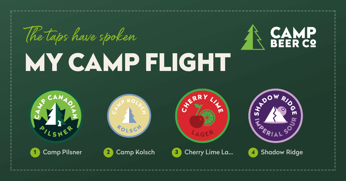
- /The flight spinner & the pour-fillThe signature interactions: a camp-styled slot machine that deals a flight in tasting order with the upcharge math already done, and beer sheets that pour themselves full of the beer's actual colour while you read.
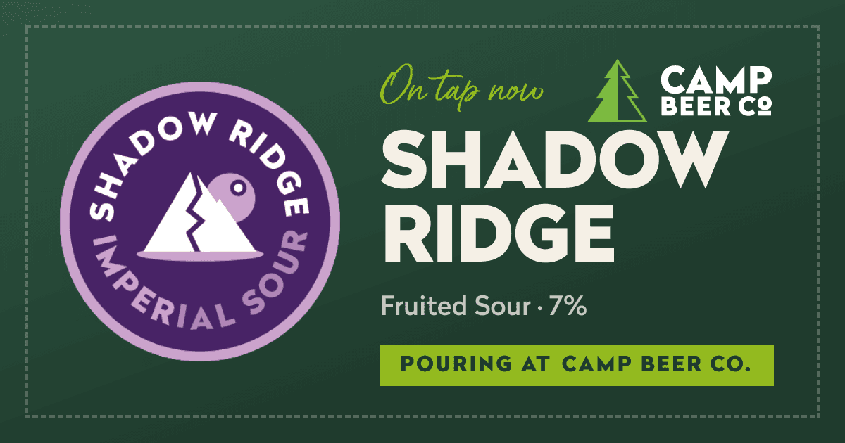
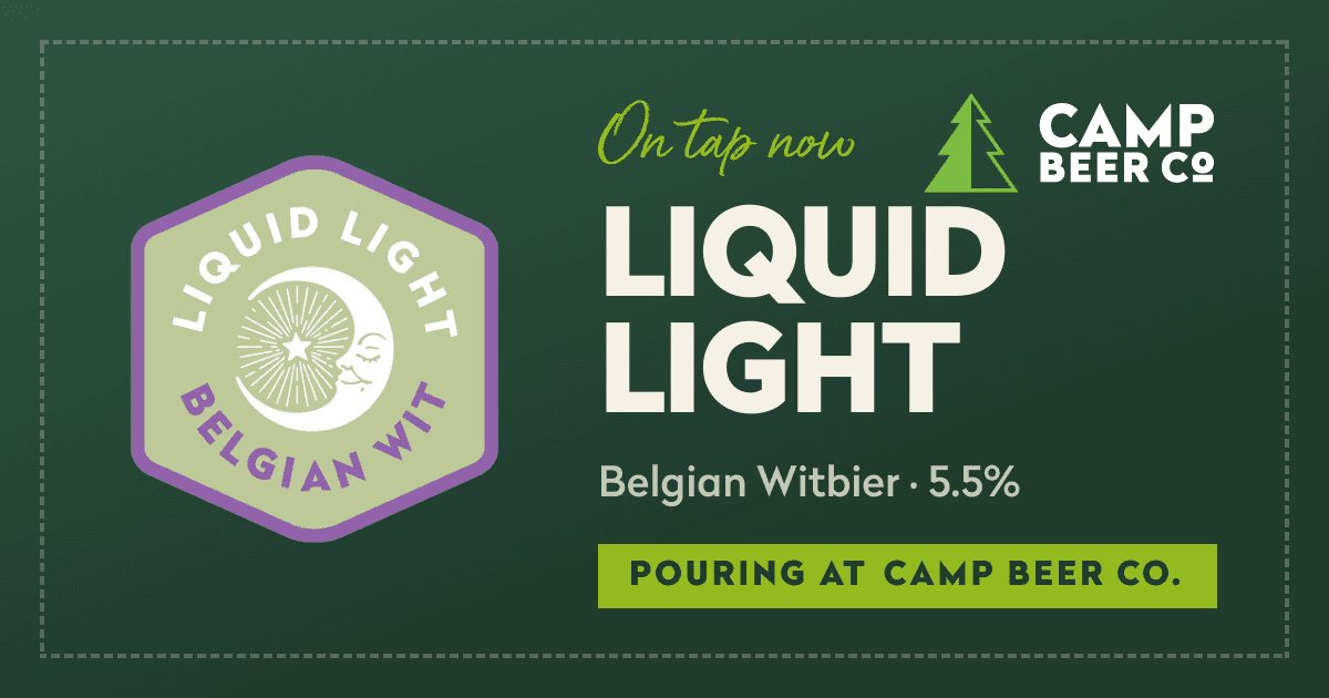
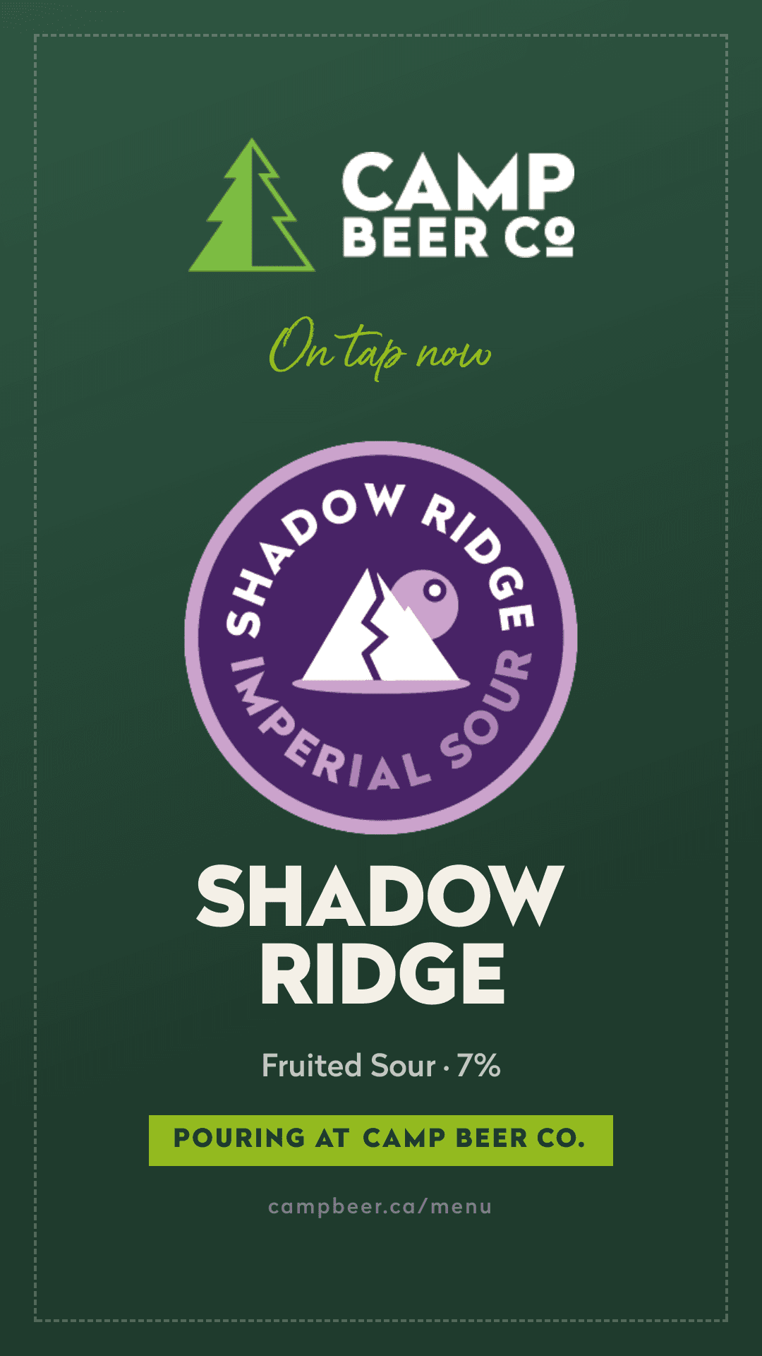
- /Share cards & the Poster RackA branded poster for every beer and every spun flight, rendered live from the taplist in landscape and story formats — shared as an image file so Instagram Stories is one tap away. Staff get the Poster Rack: a page where tonight's post is already made.
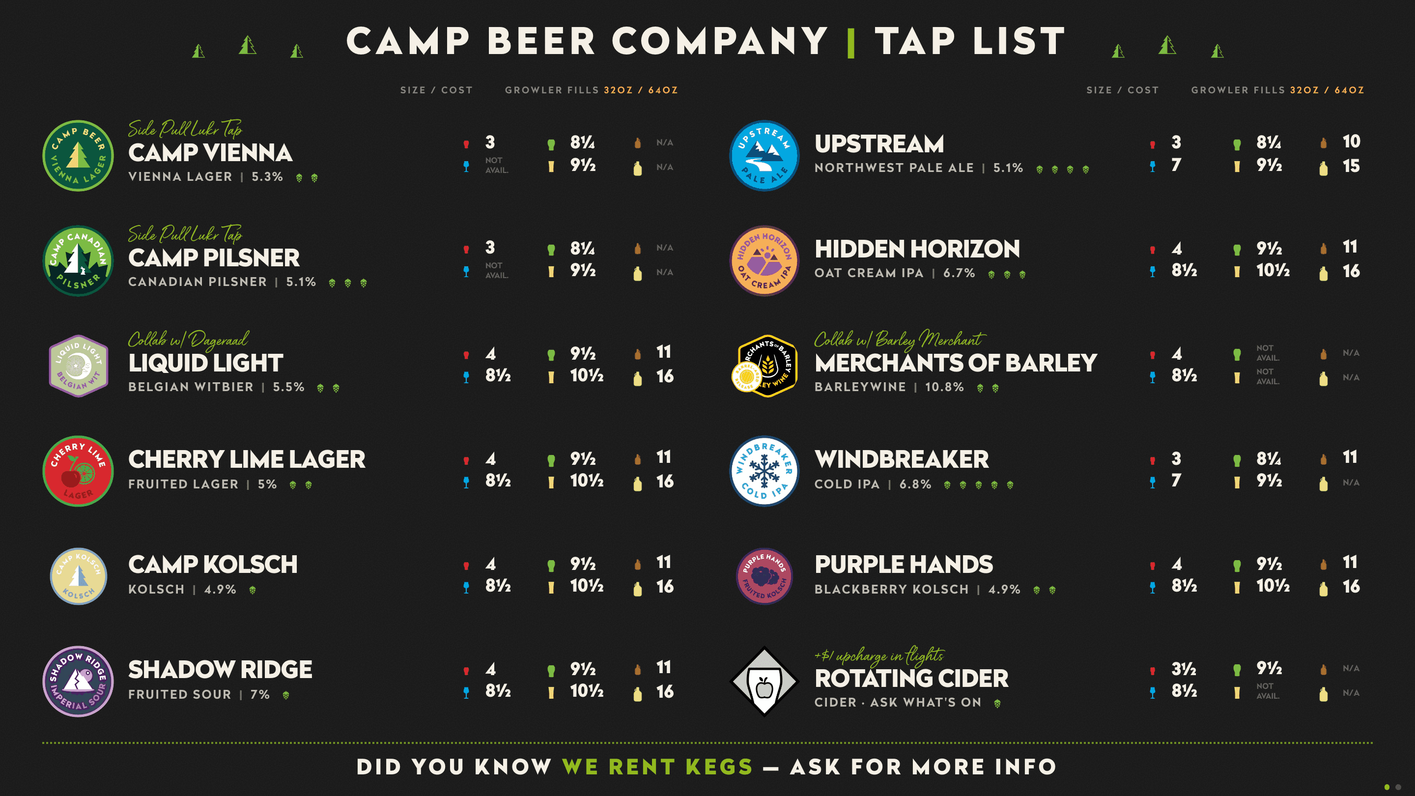
- /Self-updating TV tap boardA full-screen board for the taproom screens that refreshes itself and takes over for Campy Hour automatically — retiring a workflow that meant rebuilding a file every few days and mirroring it from an iPad. Tuned for the room: every price on the board, two columns, type readable from the far wall.
Guest experience is № 1 at Camp. The site had to act like it.
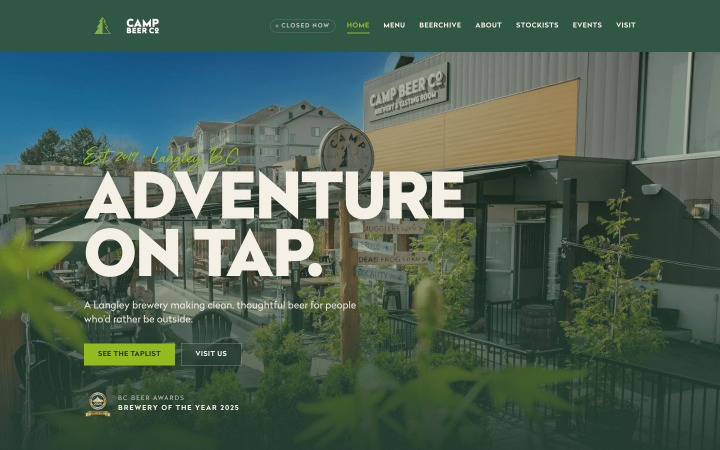
Camp isn’t a default brewery — they’re BC Beer Awards’ Brewery of the Year, and the thing they protect hardest is how it feels to be a guest there. That was the bar for the site, in their words: interactive, not a brochure. So it answers the questions a guest actually has, live — is it patio weather, are the doors open right now, what’s on tap this minute, is Campy Hour on. Small, genuinely useful, a little bit delightful. The kind of thing a guest doesn’t notice consciously — they just leave thinking Camp has their act together.
The site knows if it's patio weather
A live strip up top reads the brewery's own conditions — current Langley weather, open or closed by the minute, how many beers are on, and tonight's event if there is one. The guest deciding whether to make the drive gets the one line that decides it.
A finder for the fifteen-tap stare
Two questions on a phone at the table — lighter or hoppier, that sort of thing — and it recommends from what's actually pouring right now. The “I don't really know what I like” guest gets a confident answer instead of a wall of taps.
Campy Hour that turns itself on
Happy hour computes from the clock. At 3pm the menu and the TV light up with an “on now” badge on their own, and switch off when it's over — nobody flips a toggle, and it's never wrong.
Seven years of beer, browsable
The Beerchive: every beer Camp has ever brewed — 212 of them, badge art and all — pulled from Untappd into a filterable, searchable archive. A brand museum that rewards the curious and shows off the range.
Events that know their own schedule
Recurring events compute their own next occurrence — bingo night never goes stale, and the events strip on the QR landing page always names the next thing happening at Camp without anyone re-entering it.
A 404 with a compass
Even the dead ends are on brand: a lost visitor gets a compass and a trail back to camp instead of an error code.
None of it is gimmick. The cinemagraph hero, the film-grain texture, the sharp, brand-true type — every detail is there to make the experience feel built rather than assembled. For a brewery that has earned the top spot in the province, second-best wasn’t the brief.
In the client’s words.
I have worked at Camp Beer Co. in many different capacities, from serving to multiple management roles and now as General Manager. Throughout all of those roles, one thing consistently frustrated me: our website menu. While it looked great, it wasn’t practical. Even our regulars struggled to find items because of the scrolling layout, and simple updates could break the entire menu. I approached Sam hoping for a menu that was easier for guests to use and easier for our staff to manage. He solved that almost immediately — but he didn’t stop there.
Sam looked beyond the brief and completely rethought how our website could support our business. He introduced features like personalized beer suggestions, notifications when favourite beers are back on tap, and better ways to highlight specials and new releases. Instead of simply delivering what I asked for, he built a website that actively supports the hospitality experience we want every guest to have. The difference has been obvious to both our staff and our guests, and I couldn’t recommend Sam more highly.
Camp Beer Co.
Run a place like this? Let’s make it run itself.
I work with a small number of owner-operators at a time. If your menu, your website, and your screens are three separate jobs, they shouldn’t be — let’s talk.