Building for a designer: the one client you can’t bluff.
How I took Serif + Gold’s new identity from the designer’s own Figma to a production site he now runs himself — four-corner navigation, a colour system per case study, and a CMS that can’t break the design.
A studio that sells taste, stuck on a template.
Serif + Gold is Aaron Armstrong’s brand and packaging studio in Surrey, BC — strategy, identity, and CPG packaging, with fifteen projects’ worth of shelf-ready work behind it. The studio’s product is design judgment. Which made the old website a problem: a stock Wix template that said nothing about the studio, in someone else’s visual language.
So Aaron did what a designer does. He designed the replacement himself, in Figma, completely — every page, the navigation system, the type, the motion, down to the drawn plus sign in the wordmark. What he didn’t have was the other half: someone to turn a very opinionated design file into a fast, accessible production site, and then hand him the keys to the content.
The design was already done. The job was to ship it without losing anything, and give it back editable.
Off the template, onto his own system.
This is the second site I’ve moved off Wix, and the reason was different this time. Camp Beer Co. left because editing the template had become fragile — every price change was a risk. Aaron is a professional designer; he could drive Wix better than most people who build on it. His problem wasn’t the editing. It was the ceiling.
A template builder hands you a theme and some settings, and everything you make lives inside what that theme can express. Aaron’s design doesn’t fit inside a theme: navigation that lives in four blend-mode corners, a licensed typeface, a colour world per project, tiles that morph into pages. None of that is a widget you can drop in. The only way to get it was to build the front end in code, where the design is the source rather than a setting.
The migration itself was half the job. Fifteen projects’ worth of copy and hi-res imagery came out of Wix pages and into a structured content model, seeded with idempotent scripts so it could be re-run safely while Aaron kept editing. By the end, nothing of the old site remained except the things worth keeping: the work, and the words.
A theme became a system
On Wix, the site wore a template's decisions — its type, its spacing, its rounded corners. Now every decision is Aaron's: National 2 self-hosted, the drawn wordmark inlined as a vector, sharp corners everywhere the theme would have softened them.
Pages became data
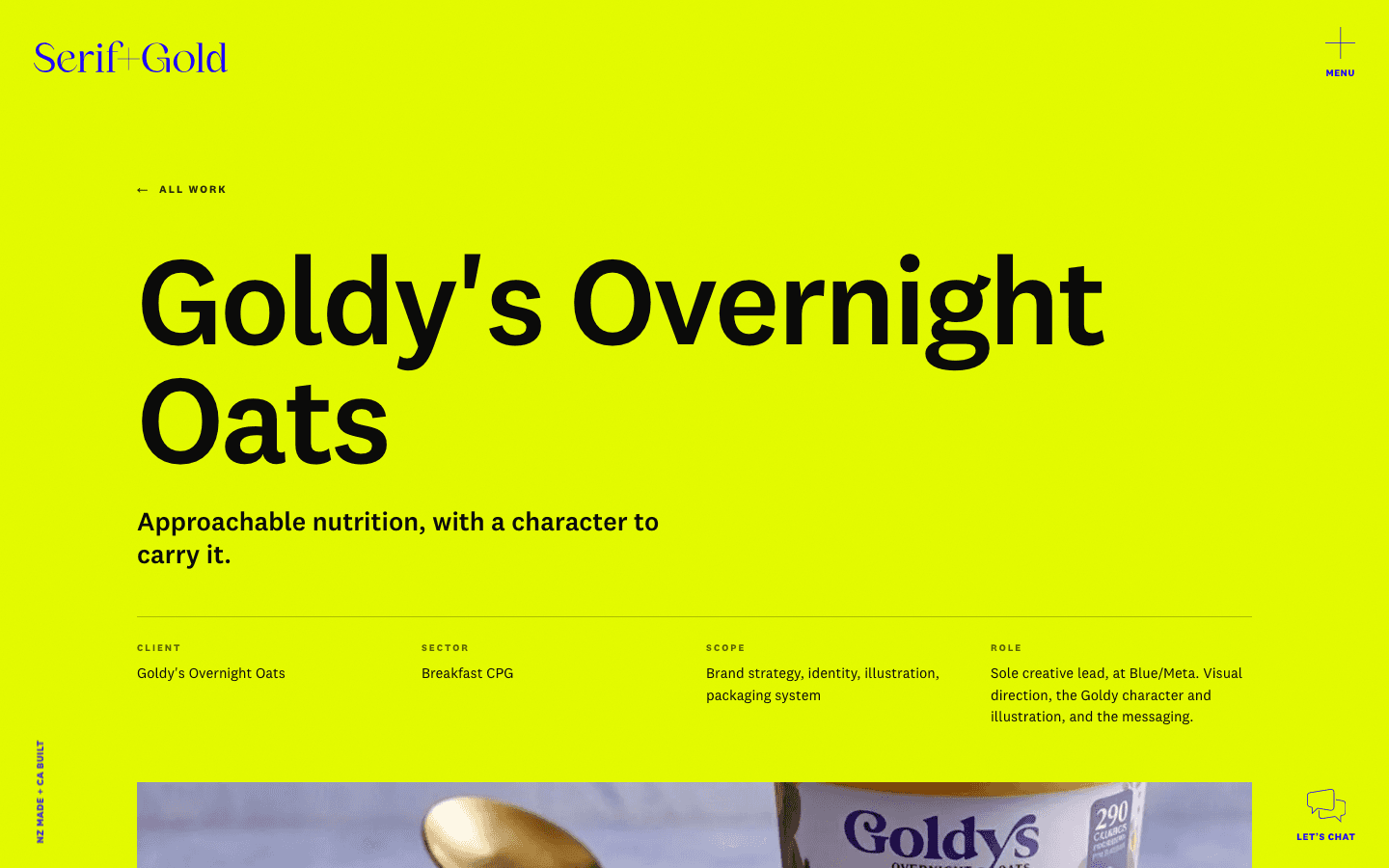
On the old site, each project was a page someone had laid out once. Now a case study is structured content — title, standfirst, numbered sections, quotes, imagery — and the design renders it. The content and the layout never touch, which is exactly why neither can hurt the other.
Widgets became code
Template builders give you the closest available embed. The new site's interactions are purpose-built instead: the drag-through gallery, the follow cursor, the tile-to-page morph, corners that hold contrast over any colour. None of that exists as a widget.
A builder became a build
No page-builder runtime shipping to every visitor. The new site serves static, prerendered pages with images optimized per device, and republishes itself within a minute of Aaron hitting publish.
Four things a template can't do.
The Figma was the contract
Aaron designed every page himself, to the pixel — type scale, spacing, the licensed National 2 typeface, sharp corners on everything. My job was translation without loss. When the client can spot a wrong letter-space from across the room, “close enough” isn't a setting that exists.
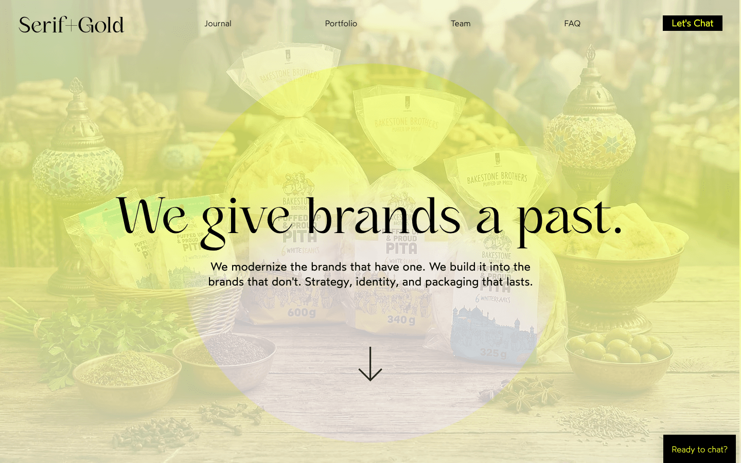
Navigation with no navbar
The design puts the whole shell in four fixed corners: wordmark, menu, booking, and a provenance mark. Those corners sit over photography and fifteen different background colours, so they keep contrast with a blend mode rather than per-page logic — and the whole system is keyboard-operable, with focus managed and Escape closing every panel.
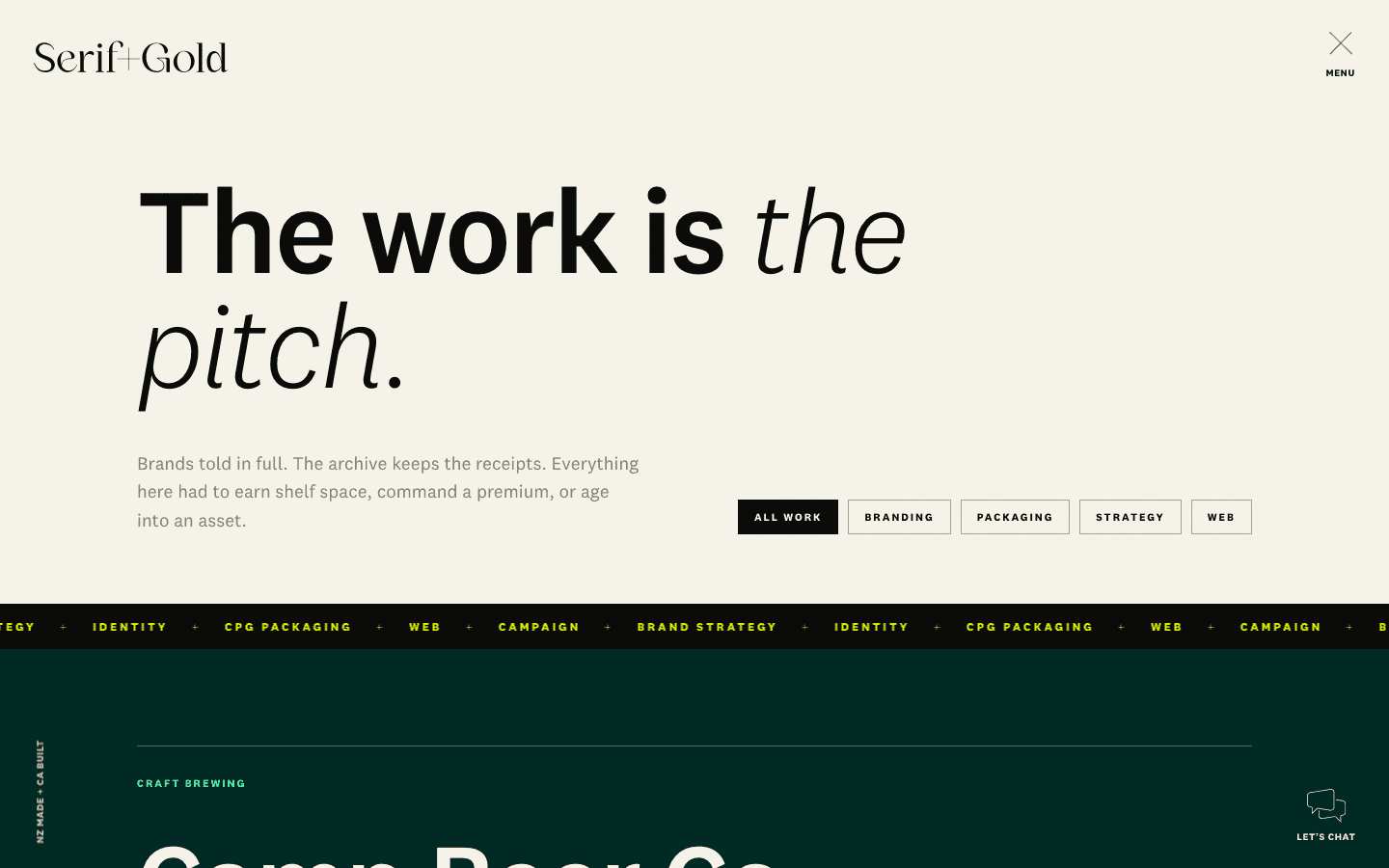
Fifteen case studies, fifteen palettes
Every project on the site carries its own colour world — volt, plum, pine, gold. The content for each lives in the CMS, but the design tokens live in code and merge in by slug at render. Aaron can change every word and image on the site; he cannot push the design out of spec. That split is the whole trick.
A designer reviews like a designer
Feedback arrived as pinned comments on Vercel preview deployments. Three rounds, dozens of pins — a few strategic (rebuild the hero as a drag-through gallery), most surgical (this title a size down, this arrow the other way, this wordmark in volt). Every pin shipped back onto the same preview, usually the same day.
The same studio, finally in its own clothes.
Half of this site only exists when it moves.
Screenshots undersell it. Thirty seconds from the live build: the wordmark folding to the compact S+G mark on scroll, the volt “View” cursor trailing the pointer, a drag through the work gallery — Aaron’s own animation loops playing in the tiles — and a click through into Goldy’s volt-yellow case study. Every one of these moves switches itself off for visitors who prefer reduced motion. Including this video.
by the client, not me
in his Studio
of a navbar
design from the CMS
The handover test isn’t the training call. It’s opening the site three weeks later, finding it full of work you’ve never seen, and it still looks designed.
The full scope.
- /Design-to-code, at fidelityThe full site built from Aaron's Figma in Next.js and TypeScript — plain CSS on a design-token layer, the licensed National 2 typeface self-hosted through next/font, and the drawn brand marks inlined as vectors. Nothing approximated.
- /The four-corner shellOne shared corner system across every page: menu panel, contact overlay, scroll-aware wordmark. Focus is trapped and returned properly, Escape closes everything, corners collapse to two on mobile, and every animation honours reduced-motion settings.
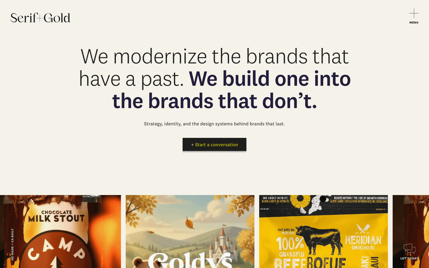
- /A hero you drag throughThe homepage opens onto a draggable gallery of work tiles with a follow cursor, fed from the CMS — Aaron drops in his own animation loops and they join the strip. Case-study tiles in the gallery share a view-transition name with their case-study hero, so clicking one morphs the tile into the page.
- /Sanity, split down the middleAn embedded Studio at /studio with seven content types — case studies, journal posts, services, FAQs, client logos, hero media, and the About page. Content, imagery, and rich text live in Sanity; colour themes and layout live in code. Aaron gets total editorial control and zero ways to break the design.
- /Booking-first contactA Cal.com calendar embedded in both the contact overlay and the contact page, so “let's chat” means a booked call, not an email thread. Email as the fallback, no phone number by choice.
- /The quiet layerPer-page metadata and structured data, sitemap, semantic headings, alt text, keyboard support, optimized images, and incremental static regeneration — so anything Aaron publishes is live on the site within the minute, on pages that stay fast.
He stayed in Figma. I stayed in code.
On my home page I say I can slot in alongside a designer you already trust. This is what that looks like in practice. Aaron never touched the repository; I never redesigned his work. The interfaces between us were his Figma file, Vercel preview links, and pinned comments — he pins, I ship, the same preview updates. Most rounds turned around inside a day.
The handover ran the same way. Within days of getting his Studio, Aaron had replaced my seed content entirely: fifteen case studies, real journal posts, his own imagery, all published without a single message asking how. From first commit to a client-run production site took under a month. That was the point — a site this designed, that doesn’t need me around to stay that way.
Corners that never lose contrast
The four corners float over photography, volt, plum, charcoal — whatever a page throws at them. A CSS blend mode keeps them legible over all of it, with no per-page colour logic to maintain.
Tiles that become pages
Gallery tiles and case-study heroes share a view-transition name, so navigating reads as the tile growing into the page rather than a hard cut. It's the kind of detail a brand studio's site should have, and most don't.
A Studio that can't wreck the layout
No drag-and-drop canvas. Aaron fills structured fields — title, standfirst, numbered sections, pull quotes, a background choice per band — and the site renders them correctly every time.
Motion that knows when to stop
The launch flourish fires once per session and never for visitors who prefer reduced motion. Marquees, morphs, and the follow cursor all check the same preference. Quiet by default is a brand position here.
Got a design that deserves better than a template?
I build alongside designers as happily as I design myself. If you’ve got a Figma file waiting on a developer, or a brand that’s outgrown its website, let’s talk.